This project served to brand an entirely new in-home consumer water distillation product. Developing an entirely new brand – especially where we had the opportunity to consult on aspects of the product design itself, was an exciting opportunity.
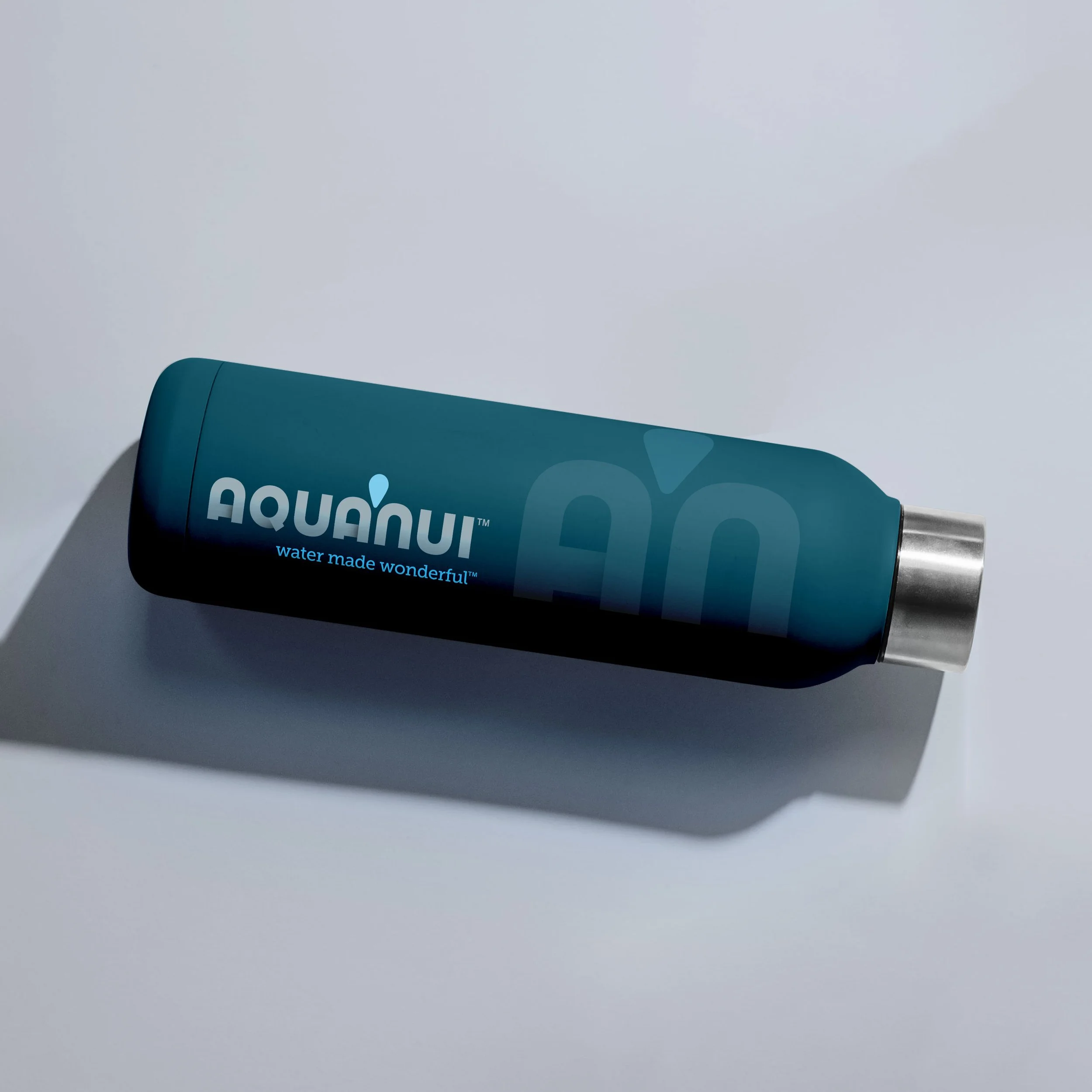
Because the client was of New Zealand decent, incorporating aspects of the Maori language was important. At the same time, this presented unique challenges. Of course, “AquaNui” isn’t a word. It’s more of a compound of one anglo-latin word (aqua) combined with a Maori word (nui). There’s always risk in a mark with visually unfamiliar words, since we read words, not by sounding them out, but by identifying the shapes & reconciling those with what we already know about type landscape.
For this reason, we knew it would be important to create a legible typeface, and also to separate the compound words in a subtle way, which was served nicely by the water drop. Flipping the drop upside down nested it comfortably with the characters & provided a subtle & appropriate reference to water evaporation.
The typeface design was also driven by the commonality of the characters themselves – something a seasoned designer analyzes initially, noting opportunities for geometric compatibility. In this case, there were many, and we felt it important to leverage this “gift”.
If you've worked hard to build your business's reputation and appeal, all of that equity is now connected to your logo and other visual elements. Whether you are staring a new venture or revitalizing an existing brand, even the smallest nuance can make or break a logo.